# Buttons and Lists
## Introduction
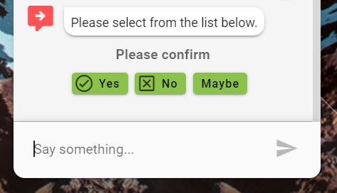
Buttons that present options to the user are typically only shown for the current turn in conversation for which they were meant to be shown. Once the user clicks a button or moves the conversation forward through text or voice, the button options in the response are removed from the UI.
{% hint style="info" %}
Under certain scenarios you can make some buttons or options remain permanently - regardless of the turn of conversation.
{% endhint %}
## Buttons
### Output Parameter
```groovy
extensions = ${ExtensionHelper.displayClickableList(yesNoMaybeOptions,channel)}
```
If you wanted the **buttons to persist and remain active** for any reason then specify this output parameter:
```groovy
extensions = ${ExtensionHelper.displayPermanentClickableList(yesNoMaybeOptions, channel)}
```
If you wanted the **buttons to persist and automatically disable after the conversation moves on.**
```groovy
extensions = ${ExtensionHelper.displayPermanentDisabledClickableList(yesNoMaybeOptions, channel)}
```
Where `yesNoMaybeOptions` is a groovy map stored either as a flow or global variable
```groovy
def yesNoMaybeOptions = ["title": "Please confirm",
"items": [
["name": "Yes"],
["name": "No"],
["name": "Maybe"]
]]
```
{% hint style="info" %}
You can configure the map such that some custom request parameters are sent back to Teneo when a specific button is clicked. This might be useful for metadata reporting in Teneo Data or you might just want to trigger a flow based on the existence of a certain request parameter.
{% endhint %}
```groovy
def yesNoMaybeOptions = ["title": "Please confirm",
"items": [
["name": "Yes"],
["name": "No"],
["name": "Maybe", "params": "paramname=this-will-be-sent-back-in-url-when-maybe-option-clicked-optional"]
]]
```
### JSON
```javascript
{
"name" : "displayCollection",
"hasLongOptions" : false,
"permanent" : false,
"parameters" : {
"content" : {
"title" : "Please confirm",
"items" : [
{ "name":"Yes" },
{ "name":"No" }
]
}
}
}
```
## Buttons with Icons
As before you can display buttons but you can optionally define custom icons shown in the buttons and you can optionally control what is sent back to Teneo as user input text. Therefore the button says one thing but the text that is sent back after a click could be something different.
### Variable
```java
def buttonIconOptions =
["title": "Some UI Elements",
"items": [
["name": "Form Button Text", "text": "This is sent as user input", "icon": "book-information-variant"],
["name": "Map Button Text", "text": "Where are you located", "icon": "google-maps"],
["name": "Youtube Button Text", "text": "Tell me about your company", "icon": "youtube"],
]
]
```
### Output Parameter
```groovy
extensions = ${ExtensionHelper.displayClickableList(buttonIconOptions, channel)}
```
If you wanted the **buttons to persist** for any reason then specify this output parameter:
```groovy
extensions = ${ExtensionHelper.displayPermanentClickableList(buttonIconOptions, channel)
```
### JSON
```javascript
{
"name" : "displayCollection",
"hasLongOptions" : false,
"permanent" : false,
"parameters" : {
"content" : {
"title" : "Please confirm",
"items" : [
{ "name":"Yes" },
{ "name":"No" }
]
}
}
}
```
## Buttons with Colors
The default color for buttons comes from the success theme color configured for the solution. If you want to change the color of a specific button you can define a `color` property in the json.
```groovy
def yesNoMaybeOptions = ["title": "Please confirm",
"items": [
["name": "Yes"],
["name": "No", "color": "#FF4C5B"],
["name": "Maybe", "params": "paramname=this-will-be-sent-back-in-url-when-maybe-option-clicked-optional"]
]]
```
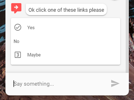
## Line Based Options
### Output Parameter
```groovy
extensions = ${ExtensionHelper.displayClickableList(yesNoMaybeOptions,channel, true)}
```
If you wanted the **buttons to persist and remain active** for any reason then specify this output parameter:
```groovy
extensions = ${ExtensionHelper.displayPermanentClickableList(yesNoMaybeOptions, channel, true)}
```
If you wanted the **buttons to persist and automatically disable after the conversation moves on.**
```groovy
extensions = ${ExtensionHelper.displayPermanentDisabledClickableList(yesNoMaybeOptions, channel, true)}
```
Where `yesNoMaybeOptions` is a groovy map stored either as a flow or global variable
```groovy
def yesNoMaybeOptions = ["title": "Please confirm",
"items": [
["name": "Yes"],
["name": "No"],
["name": "Maybe"]
]]
```
{% hint style="info" %}
You can configure the map such that some custom request parameters are sent back to Teneo when a specific button is clicked. This might be useful for metadata reporting in Teneo Data or you might just want to trigger a flow based on the existence of a certain request parameter.
{% endhint %}
```groovy
def yesNoMaybeOptions = ["title": "Please confirm",
"items": [
["name": "Yes"],
["name": "No"],
["name": "Maybe", "params": "paramname=this-will-be-sent-back-in-url-when-maybe-option-clicked-optional"]
]]
```
### JSON
```javascript
{
"name" : "displayCollection",
"hasLongOptions" : true,
"permanent" : false,
"parameters" : {
"content" : {
"title" : "Please confirm",
"items" : [
{ "name":"Yes" },
{ "name":"No" }
]
}
}
}
```
## Line Based Options - Background Color
If you want to change the background color of all the line based option then you can define a `color` property in the json.
```groovy
def yesNoMaybeOptions = ["title": "Please confirm",
"color": "#C9C3FF",
"items": [
["name": "Yes"],
["name": "No", "color": "#FF4C5B"],
["name": "Maybe", "params": "paramname=this-will-be-sent-back-in-url-when-maybe-option-clicked-optional"]
]]
```
## Quick Button Format
If you just want to quickly produce some buttons then it might be easier to call `simpleDisplayClickableList`
### Output Parameter
```groovy
extensions = ${ExtensionHelper.simpleDisplayClickableList(
"Please Choose; Yes; No; Maybe", "webview")}
```
---
# Agent Instructions: Querying This Documentation
If you need additional information that is not directly available in this page, you can query the documentation dynamically by asking a question.
Perform an HTTP GET request on the current page URL with the `ask` query parameter:
```
GET https://jolzee.gitbook.io/leopard/components/buttons-and-lists.md?ask=
```
The question should be specific, self-contained, and written in natural language.
The response will contain a direct answer to the question and relevant excerpts and sources from the documentation.
Use this mechanism when the answer is not explicitly present in the current page, you need clarification or additional context, or you want to retrieve related documentation sections.


